
Cy Twombly
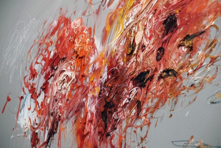
I found an artist that used heavy brush strokes and different colours to create a physical manifestation of paint. All Twombly’s work focuses around the physicality of paint applied to canvas. I then what to apply this to the idea of painting with light using the fibre optic lamp being similar to Twombly using a paint brush. In the same way that Twombly builds up layers of paint to create a sense of structure, I too will use several strokes to build more densely lit areas on my subjects. However my method uses light strokes instead of paint strokes
Similarly to the “Dust” shoots, I set the camera up on a tripod with a remote trigger. I had the aperture set between F/11 – F/13 for dark and high quality image. I set a low iso to minimise how much of the background was visible and give a strong silhouette. The camera shutter was set to timer release (normally between 10-30 seconds depending on the complexity of the lamp movements). However, unlike the “Dust” shoots I didn’t use any flashguns because I was going for a dark long exposure and not a well-lit short exposure.
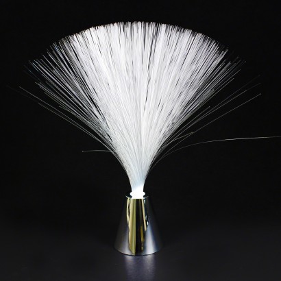
I attempted to re-create this painting method with light. I achieved this by using a fibre optic toy lamp (see below). This toy lamp is designed to change colour and project the light to the end of fibre optic cables. I took the lamp and lightly outlined my subjects to create a dark silhouette.
However, after taking 4 photos attempting this method, I noticed all my images were improperly focused. This is because the lens I was using had no manual focus and was trying to autofocus on a completely dark image. I decided that I needed a lens that didn’t auto focus, so I postponed the shoot until I could buy a lens with manual focussing capabilities.


Second Shoot
Instead of buying a new lens I borrowed a lens. However this led to the first issue I encountered. The lens I had borrowed for this shoot that was capable of manual focusing was a 70 – 300 mm lens. This meant that the camera had to be located further away from the subject to fit the whole image in, which was an issue because some of the images have had parts cropped out where the image was improperly framed. Another reason some of my images were improperly framed was due to the nature of this shoot having to occur in complete darkness, making it very challenging to correctly frame the image.
I also decided that the multi-coloured auras looked too over-stated and tacky, so I changed my set-up for painting. I removed the fibre optic head from the multi-coloured base. I then attached it to a torch with tape (see below to see this new light tool.) I also added Quality Street wrappers folded over 2 times to change the colour of the fibres.
[SHOW LIGHT PAINTING TOOL]
I selected 17 images to edit in Lightroom to remove anything that negatively effects the image’s atmosphere, to darken the blacks, enhance the colours and highlight details that may have otherwise been missed. After editing all 17 images I then chose 6 that I felt were most effective at portraying the fibre optic light painting technique.
Finals


Red – The colour of fire and blood, associated with war, strength, power, desire and love. A very strong and emotional colour. It is a very visible why stop signs and fire equipment are usually painted red. I used this colour to represent passion and strength in my images, as well as taking advantage of the fact the colour is extremely visible and eye catching. It also is visually reminiscent of fire, further representing power.
Green – The colour of nature, symbolising growth, harmony and fertility. It also has strong emotional connections with safety. This made it a perfect colour to use as it has such a contrasting message to the red, juxtaposing danger with safety. It’s also a restful colour to the human eye, so it’s more relaxing and appealing to look at, giving it a calm and relaxing atmosphere.
Blue – The colour of the sky and sea, associated with depth, wisdom, trust and stability. This colour was used to neutralise the strong messages of red and green, a sort of in-between colour. Blue was more about trying to juxtapose the way the image was captured with the calming nature of the colour itself. Unlike the other images, blue was captured differently: I tied the fibre tool up half way, so it could spread out less, leading to a more harsh and less textured image, making it look more sporadic and disorganised, which is the complete opposite to the calm neutral of the blue. This left the true message of the image to be decided by the viewer.
